The Backstory:
New construction at an established hospital to expand on the broad range of healthcare services offered throughout central Florida. This includes new facilities dedicated to women and infant care. The goal is to create thoroughly modern facilities designed from the ground-up to provide best-in-class patient experiences and healthcare. The community the hospital serves features an incredibly high degree of cultural and ethnic diversity.
Hospital management wanted to implement a healing art program that met the following requirements:
- The art program must actively support and contribute to the hospital’s mission to heal
- The art program must nurture wellness and well-being within the community (which includes patients, their families, and hospital staff)
- The art must align with the hospital’s commitment to providing a modernized, patient-centric healthcare experience
- The art program must be able to appeal to and engage a highly diverse community
- The art program must reflect modern, research-driven design methodologies
- The hospital wanted to commission a signature work for display in the new main entrance that engaged people as soon as they entered the facility
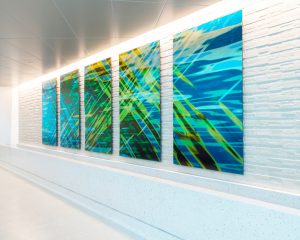
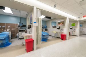
Working in close collaboration with the hospital and their architectural firm HuntonBrady Architects, the Great American design team implemented an innovative holistic art program throughout the facility that included waiting areas, patient rooms, exam rooms, and transitional and reception spaces. They also worked directly with a sculptor to create a stunning installation for the main lobby.

The Lobby:
Design Statement: “Create a sense of tranquil but fluid motion to convey the hope that can be found in the ongoing continuity of life.”
Going to the hospital can be an incredibly stressful experience. Just entering a hospital can quickly heighten feelings of anxiety and worry, because it can trigger thoughts of illness, injury, pain, and other negative thoughts. The goal was to create a work that was able to quickly capture peoples’ attention as soon as they entered the building, distract them from any initial negative or worrisome thoughts, and instead reflect feelings of wonder, curiosity, and hope.
Florida’s, and Floridians’, association with the ocean is as ubiquitous as their association with warm weather. Because of this, initial concepts centered on incorporating objects or shapes that would immediately connect the viewer with water, and the movement either of the water itself, or the movement of objects through it.
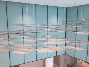
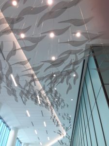
The final piece is a ceiling hung mobile made up of hundreds of abstract shapes evoking the sense of fish speeding through water. The fluid look-and-feel of the sculpture is such that the strong sense of movement and life also projects a sense of tranquility instead of hectic or aggressive momentum.
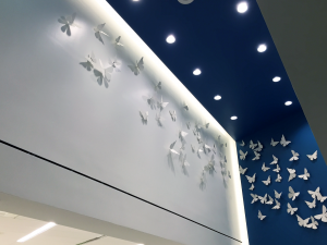
To compliment the liquid movement of fish-through-water, we created a complimentary piece that celebrates the freedom of flight. And who doesn’t love butterflies!?

Transitional and Reception Areas
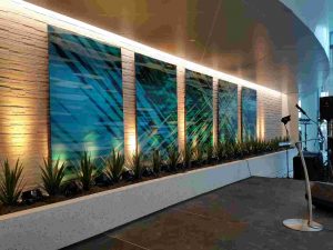
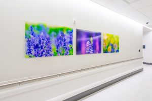
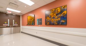
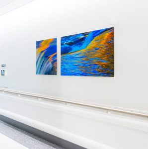
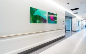
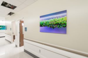
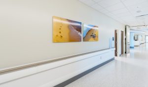
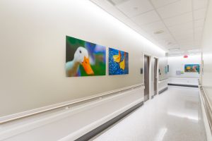
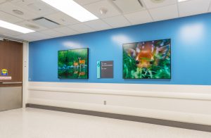
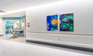
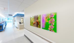
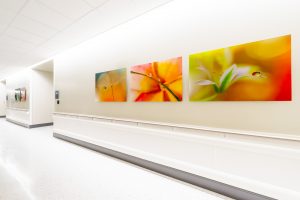
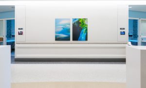
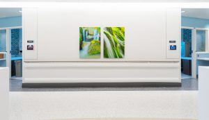
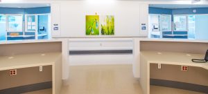
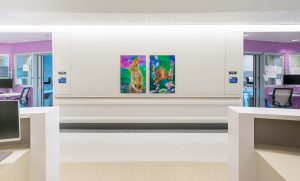
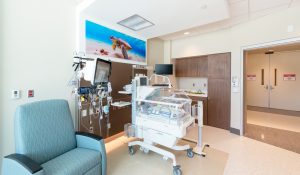
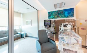
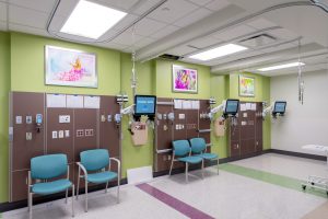
Design Statement: “Vibrantly colored images depicting a variety of nature imagery ranging from whimsical to serene immediately capture one’s attention with delight, while also helping to provide clear and distant visual landmarks to aid in wayfinding.”
Focussing specifically on a variety of nature imagery featuring a diverse range of animals, habitats, and scenery, we created a portfolio of brilliantly colorful images using our patented ‘Grin & Aww’ test. When selections were reviewed internally or with the client, if an image elicited either a broad grin or a thoughtful ‘aww’, it became a candidate for final selection. If an image received a negative or no reaction, it was out of consideration.
To accentuate the bold colors of the images and really make them ‘pop’, we opted to produce the art on 1/4″ acrylic as opposed to canvas or paper.

Patient Rooms
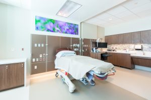
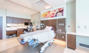
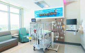
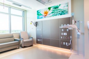
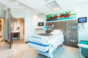
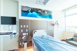
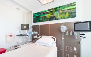
Design Statement: “Help those confined to bed rest mentally escape their physical limitations through happy imagery placed in easy sight lines.”
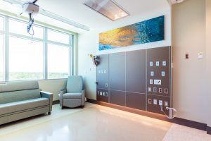
Nature art reproduced on acrylic to maximize the interplay of ambient light and color was (securely!) installed directly overhead, allowing it to be easily visible when reclining or lying down.

Exam Rooms
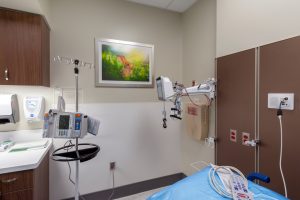
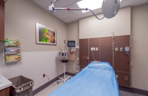
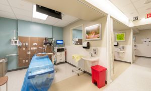
Design Statement: “Anxiety and stress are often peaking in these spaces, along with feelings of illness or pain. The need to try and capture the eye to distract the mind is high.”
Matted macro nature photography was used to help engage the mind on something other than the exams. Metallic finished frames were selected to help call-out and better segregate the art from the surrounding visual noise of medical equipment and movement.
