A Look at the Influence of Color


Color is a fundamental element of our biological and cultural experiences of the world, of environmental design, and of art. Although whether or not our experience of color is shaped more by biology or culture is the subject of debate, research into its psychological and physiological impact continues to grow. This concern with the influence of color is not new, particularly in art. In 1810, the German poet and artist Johann Wolfgang von Goethe published A Theory of Color in which he explored the psychological impact of colors and light on mood and emotion. Goethe’s theory of color was informed by poetic insight and intuition rather than scientific research, however, his ideas are recognition that color plays a crucial role in our subjective experience of art. In the same century, color studies conducted by French chemist Michel Eugène Chevreul influenced artists associated with Impressionism and Neo-Impressionism. His 1839 book, The Principles of Harmony and Contrast of Colors and Their Applications to the Arts, informed their technique of using separated strokes of color that would be combined optically by the viewer’s eye.
Today, color theory is based on the work developed by American artist and educator Albert Munsell in the early 20th century. Munsell introduced his system in 1913 with the publication of the Atlas of the Munsell Color System. In it, he defines color according to hue, value, and chroma. Later updates to the system have aligned it more with human visual responses to color. Scholar Sally Cochrane describes the Munsell color system as a scientific compromise from the world of art. She concludes that his development of this system to “accurately and quantitatively describe the psychological experience of color” was possible because he remained skeptical “as to the scientific definition of color while retaining faith that color perceptions could be objectively quantified.” [1]
Many studies exploring our relationship to color use the Munsell system to test theories. In recent research published by the Proceedings of the National Academy of Sciences on the biological roots of color perception, babies were observed to have categories for red, yellow, green, blue, and purple – the primary hues of the system. The authors found significance in that “infants’ categorical distinctions align strikingly with those that are commonly made in the world’s different color lexicons. We also find that infants’ categorical distinctions relate to the activities of the two neural subsystems responsible for the early stages of color representation. These findings suggest that color categorization is partly organized and constrained by the biological mechanisms of color vision and not arbitrarily constructed by language…Although it is theoretically possible that color categories have biological roots, the current evidence of a categorical response to color in infancy is insufficient for a full endorsement of this theory.” [2]
Studies exploring the psychological and physiological impact of color in healthcare settings also use the Munsell color system. Although the Munsell system allows international color communication across a variety of industries and disciplines, color research has not led to the development of universal, empirical guidelines for color application in healthcare settings. In Color In Healthcare Environments, the authors conclude that such an approach would be ill-advised. Among the challenges of doing so are the inconsistencies and inaccuracies of some studies because of the methods used, an oversimplification of the psychological responses people have to color, as well as the different meanings and categorization of colors across cultures. The authors relate that” [w]hile studies have shown that color-mood association exists, there is no evidence to suggest a one-to-one relationship between a given color and a given emotion…Clearly, colors do not contain inherent emotional triggers. Emotional responses to colors are caused by culturally learned associations and by the physiological and psychological makeup of people…The plurality, or the presence of multiple user groups and subcultures, and the complexity of the issues of meaning and communication in the environment make efforts to prescribe universal guidelines a futile endeavor.” [3]
The perception of color can also be influenced by age. For example, the color red is used circumspectly in hospitals because of its association with blood and the feelings we assume the color will evoke in that context. In a study on the color preferences of healthy and pediatric patients (using Munsell’s color system) Park relates that red has been shown to be highly preferred by younger children, and this insight might inform a different approach to the color red in a pediatric setting as opposed to another. Park’s study, didn’t find significantly different color preferences between these groups of children. Though Park noted that gender seemed to play a role in preference (girls preferred red and purple more than boys), the children preferred blue and green the most.[4] Such studies point to a setting responsive approach to color.
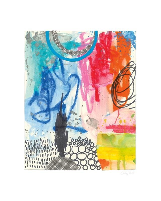
Looking at art color in art, regardless of setting, involves the recognition that color and emotional associations are shifting and varied; that colors have their own rich histories in societies and cultures; and that as an element of the language of art, color is a means for an artist to communicate ideas and beliefs, to express themselves, and to impact viewers emotionally and intellectually. Color plays an important role in creating certain moods and in conveying information.
The collection below explores the color blue, a color with a long history in art. It is a highly preferred color, which psychologists have theorized is rooted in our evolutionary development and survival through its association with clear skies and water. In art, blue has been used expressively and symbolically to convey a variety of moods and ideas: Picasso’s paintings from his blue period are understood to be linked to depression, while Yves Klein’s work with blue stemmed from his sense of boundlessness and transcendence within the color.
References [1] S. Cochrane (2014) T’he Munsell Color System: A scientific compromise from the world of art Studies’, History and Philosophy of Science, A(47), pp. 26-41 https://doi.org/10.1016/j.shpsa.2014.03.004
[2] Skelton et al.(2017) ‘Biological Origins of Color Categorization’ Proceedings of the National Academy of Sciences, 114 (21) 5545-5550. DOI: 10.1073/pnas.1612881114, (p. 5545)
[3] Tofle et al. (2004) ‘Color in Healthcare Environments’, Coalition for Health Environments Research (CHER). (p.5)
[4] Park, J. G. (2009) ‘Color Perception in Pediatric Patient Room Design: Healthy Children vs. Pediatric Patients’, HERD: Health Environments Research & Design Journal, 2(3), pp. 6–28. doi: 10.1177/193758670900200302.