The Backstory:
Newly constructed in Gallatin, TN, the St. Thomas Care Center is a new addition to the Ascension network of healthcare facilities. Two floors featuring a diversity of spaces including main waiting areas, patient rooms, corridors and transitional spaces, and a physical therapy rehab space. We had the distinct pleasure of collaborating with Gresham Smith on the project.
One key design goal was that Ascension as an organization strives to communicate a sense of ‘timelessness’ throughout all of their facilities. As a client, Ascension also asked that Great American work to be “a good steward of the Ascension dollar”.
It was essential to select artwork and design custom installations that aligned with those principals. Care had to be taken that the artwork itself would resonate as strongly years from now, as it would today. Other aspects such as the materials selected to reproduce the artwork on, frames, and so on, needed to be as durable as much as they needed to be able to help project the beauty of the artwork.

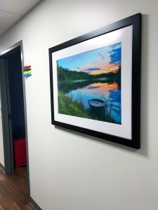
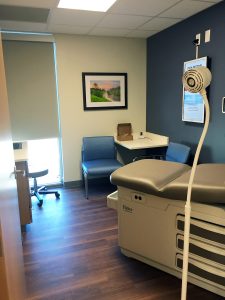
Local Art
Design Statement: “Broadcast comfort and a sense of place with images of familiar, local scenes.”
Being in any healthcare facility can be a significant source of anxiety and stress for a patient, coupled with a strong sense of disconnect as they transition from familiar spaces into unfamiliar ones. For staff, the workday leaves little time to find respite in connecting with the outside world. The positive impact that local imagery has on addressing the needs of both audiences can’t be overstated.

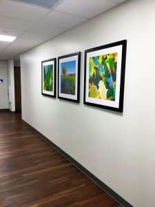
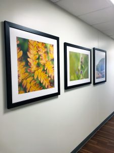
Series
Design Statement: “Allow for a feeling of movement that aligns with the “flow” of people moving between spaces.”
Creating a single installation around a series of images (often a triptych) allows the designer to heighten visual diversity and create a sense of movement using still images, while at the same time communicating a consistent and cohesive theme.

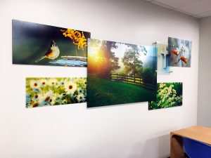
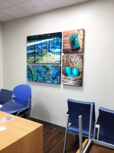
Collages
Design Statement: “High impact, high engagement, and beautiful.”
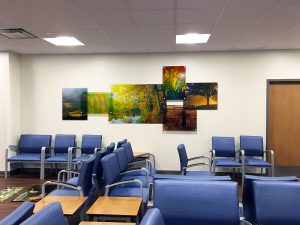
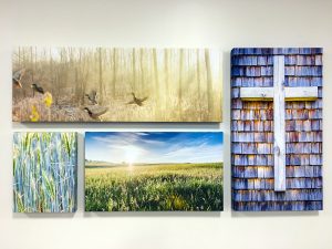
Collages take the concept of a series even further, melding individual and distinct images into a single unified whole, but without sacrificing the unique character of each separate piece.
The diversity of imagery, color palettes, sizes, and even substrates, combine to immediately capture attention. With these collages, the goals were many.
- Reflect ‘timelessness’ through natural scenery (which never goes out of style), and make sure it’s all local scenes. Present images that could be seen just by stepping outside.
- Introduce vivid color to contrast the soft to neutral accents used through out the facility.
- Use a diversity of substrates to accentuate the visual impact. We combined acrylic, aluminum, and PVC, arranged in either a masonry grid or in an overlapping arrangement.
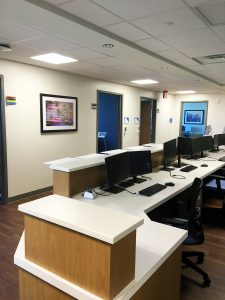
- Use highly distinguishing imagery to ease way finding. One of the largest clinics we’ve ever worked on, the clinic featured two identical wings making it very easy for the unfamiliar to feel turned around and disoriented.
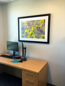
- Reflect the mission. Ascension is the largest Catholic-based healthcare network in the country. Because of this, it was important to us to broadcast the faith-based foundation of the organization, by integrating relevant imagery in with the rest of the art.
