The Backstory:
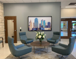
Saint Luke’s Rehabilitation Institute is a one-of-its-kind facility that re-imagines rehabilitation care for the 21st century with leading-edge technology and personalized treatment in a comfortable space close to home for the community it serves. To support their mission, it was important that Great American Art, along with the dealership, Color Art, enhance the physical environment and provide points of connection with meaningful works of art that help patients, families, and staff deal with the challenging circumstances they are faced with.

Evidence-Based Design
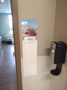
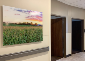
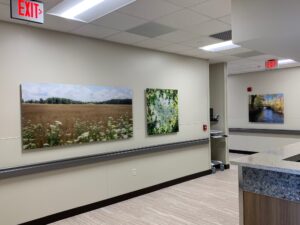
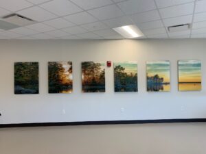
For this project, it was important to leverage evidence-based design for the selection of artwork. Local imagery within patient rooms, like this paddlewheel boat door marker, were used to provide comfort through creating a connection to the surroundings. Local nature photography was used throughout to help reduce stress and connect patients to the outdoors.
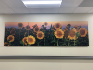
One example of local nature photography used is the sunflower, the state flower of Kansas. In this example, it is broken out over several white aluminum pieces to create an interesting focal point for a large wall that faces a therapeutic area. The use of aluminum collage continues the non-traditional, modern, look the client was looking for.

A Diversity of Substrates
A diversity of substrates creates an engaging and impactful experience throughout the space. From metals to acrylics, to acoustic panels, to wallpapers and window films, each reflects the healing art program that matches the client’s state of the art facility. The overall effect created by the substrates and the imagery selected instill comfort, serenity, hope, and safety while supporting the well-being of patients, visitors, and staff.

Promoting Movement
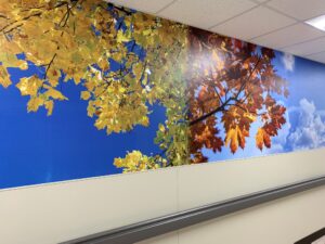
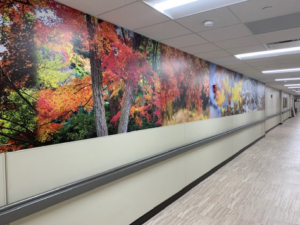
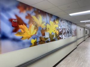
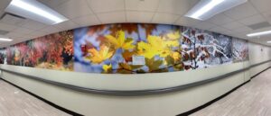
As this is a rehabilitation facility, promoting movement through art was an important component of the project. In one area, in particular, the client was looking for a creative way to track patients’ progress while adding nature art to a very long sterile corridor. The answer was a 120’ long mural depicting the changing seasons. Patients are encouraged to advance from one season to the next, as they use the hallway in their therapy. They are able to note their progress as they reach new seasons in their recovery.
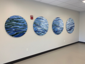
The patient therapy gym was another area where the promotion of movement was a necessity. The answer was cut-out acrylic circles depicting the movement of waves, giving one a sense of motion without being overstimulating.
The project, on the whole, was a great success. Artwork that enhances the space and provides points of meaningful connection to help patients, families, and staff deal with whatever they are working through were put in place in a modern and different way to the delight of the facility and the community it serves.
“Just wanted to thank you for your hard work on this project. I am really pleased with everything and continue to get comments from visitors on how beautiful and unique the art approach is.”
– Reagan Simpson
President of Saint Luke’s Rehabilitation Institute
VP of Saint Luke’s Health System
